Japan To Redesign Its Pictograms to Be More Foreigner Friendly
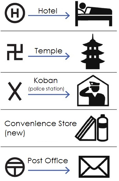
image courtesy the Asahi. Translated by Spoon & Tamago
When we moved to Japan in the early 80s my dad, a Jewish New Yorker from the Bronx, quickly realized that he had made a terrible mistake. Were surrounded by Nazis, he proclaimed, wide-eyed, as we all stared at a map of our local neighborhood in Koenji. He was, of course, looking at the manji symbol (?), a reverse swastika that could understandably be mistaken for the symbol of Nazi Germany, instead of its intended representation of Buddhist temples.
Now, over 30 years later, Japan is taking steps to update and redesign some of its more esoteric pictograms in a move intended to make the country more foreigner-friendly.
The initiative was undertaken by the GSI (Geospatial Information Authority of Japan) in an effort to improve some of the countrys pictograms that are only recognizable to the Japanese. The country is in the midst of a tourism boom, which is expected to continue as Tokyo prepares to host the 2020 Olympics.
The biggest changes are as follows:
- Hotels, previously represented by the letter H with a circle around it, will be changed to a pictogram of a person lying in bed. According to a survey, the H was often mistaken for a hospital or a heliport.
- Buddhist temples will have their ? replaced with a pictogram of a 3-tiered pagoda.
- Im not sure why police stations were ever represented by the letter X, but they will get a new pictogram of a saluting officer.
- Convenience stores, which previously had no pictogram, will be represented by a sandwich and beverage bottle.
- Post offices, previously represented by the symbol for zip codes (?) will be replaced by a pictogram of a letter.
The full list of changes, as well as an analysis of the conducted survey, can be found here (PDF English begins on page 77).
Related posts:
I think "Post Office" is the most helpful change :o).
There is one thing that cannot be translated, though. In Japan, many foreigners find that arrows showing directions disappear when you are about 100m away from the goal. Apparently, where the arrows are and where the visitors look for them are different. My Australian friend confirmed that the same thing happens in his country.
comment