Revealed: The Tokyo 2020 Olympics Emblem Designed by Kenjiro Sano
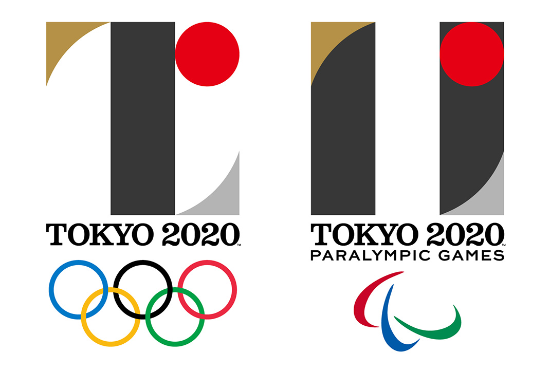
In exactly 5 years on July 24, 2020 the Tokyo Olympics will open. So today the committee unveiled the official Tokyo 2020 emblems for the Olympic and Paralympic Games. We were happy to see that the emblems were designed by Kenjiro Sano, a graphic designer who weve championed on the blog for quite some time.
Sano was chosen from an open call for submissions in which a total of 104 designers (4 of which were from overseas) submitted proposals.
The emblems are characterized by modern, abstract representations of the letter T. The symbolic letter stands for Team When the world comes together for Tokyo 2020, we will experience the joy of uniting as one team. It also stands for Tomorrow for a better world and a brighter future. And of course it also is the first letter of the host city: Tokyo.
We love the shapes and colors and our overall first impressions is pretty great.

The black color of the central column represents diversity, the combination of all colours. The shape of the circle represents an inclusive world in which everyone accepts each other. The red of the circle represents the power of every beating heart. These elements combine to create the emblems of both the Olympic and Paralympic Games.

![]() The selection committee was headed by graphic designer Kazumasa Nagai, who noted that the previous Tokyo Olympics in 1964 were represented by a simple yet powerful emblem designed by Yusaku Kamekura (left image).
The selection committee was headed by graphic designer Kazumasa Nagai, who noted that the previous Tokyo Olympics in 1964 were represented by a simple yet powerful emblem designed by Yusaku Kamekura (left image).
A large round sun at the top dominated the composition. Beneath it were the five-ringed symbol of the Olympic Games with simply TOKYO 1964 below it. However, its sculptural quality was impactful and meaningful and Nagai believes that Sanos 2020 design will have the same effect on Japan and the rest of the world.
Related posts:
This is definitely unusual, it stands out from other Olympic logos. But I will need to get used to it, maybe it is a little bit too unusual to my taste.
comment